California’s EDD Website
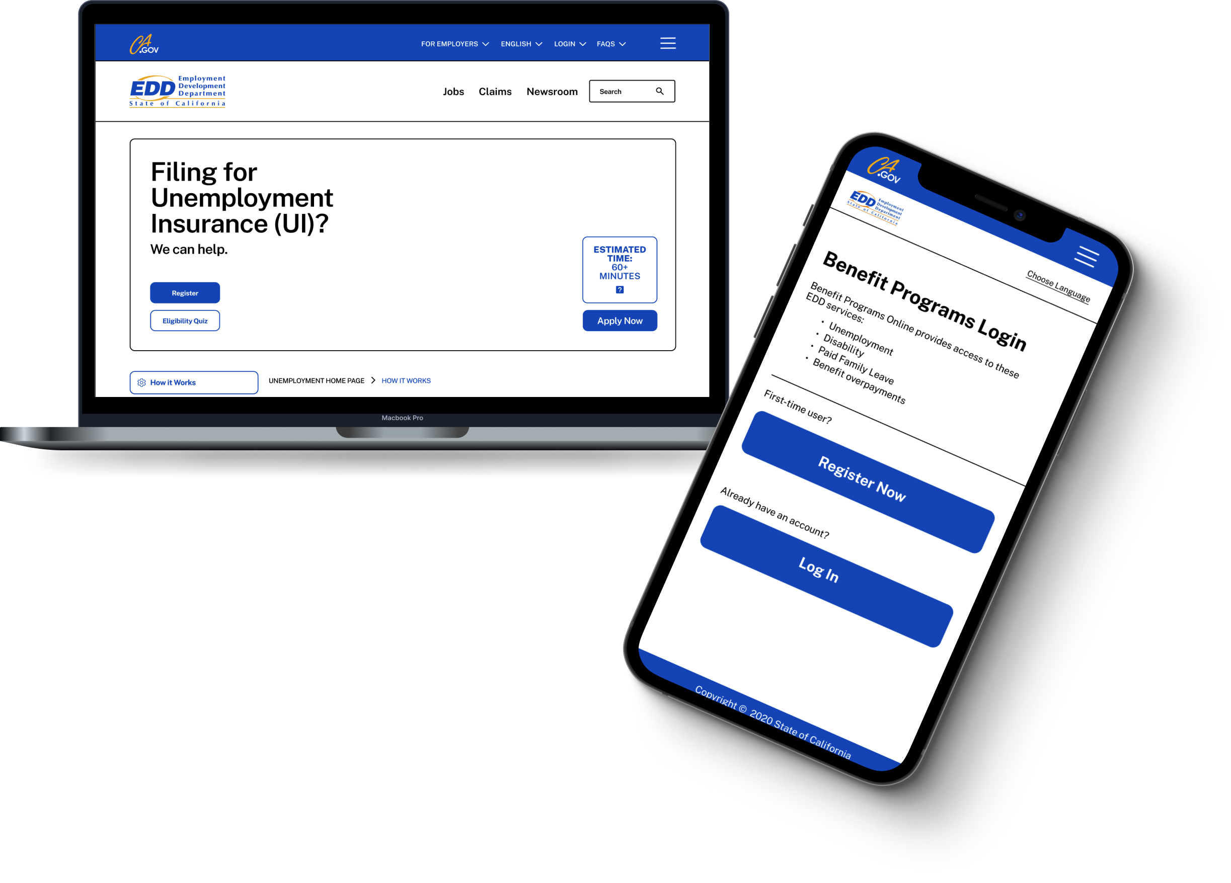
The majority of employment had been impacted by COVID-19 pandemic. The Employment Development Department in California provided unemployment insurance for many workers who lost employment during the course of the COVID-19 pandemic. Due to the influx of users, there is a need to update the EDD website.
Overview
Timeline
3 weeks
My Roles
UX Manager
UX/UI Designer
Context
Team Roles
UX Manager
UX/UI Designer
Content Strategist
Information Architect
Interaction Designer
Problem
Users are applying for Unemployment Insurance for the first time. While the current site displays many different pathways, these users need relevant and easily accessible information presented to them because they urgently need their benefits to maintain their livelihood.
We followed the User Centered Design Process to investigate how users navigated through the EDD website to apply for unemployment benefits.
After analyzing our findings through Affinity Mapping and Card Sorting, We designed an initial solution. We then tested our solution, and then developed a high-fidelity prototype.
Discover
Define
Develop
Deliver
Our Process
What We Discovered
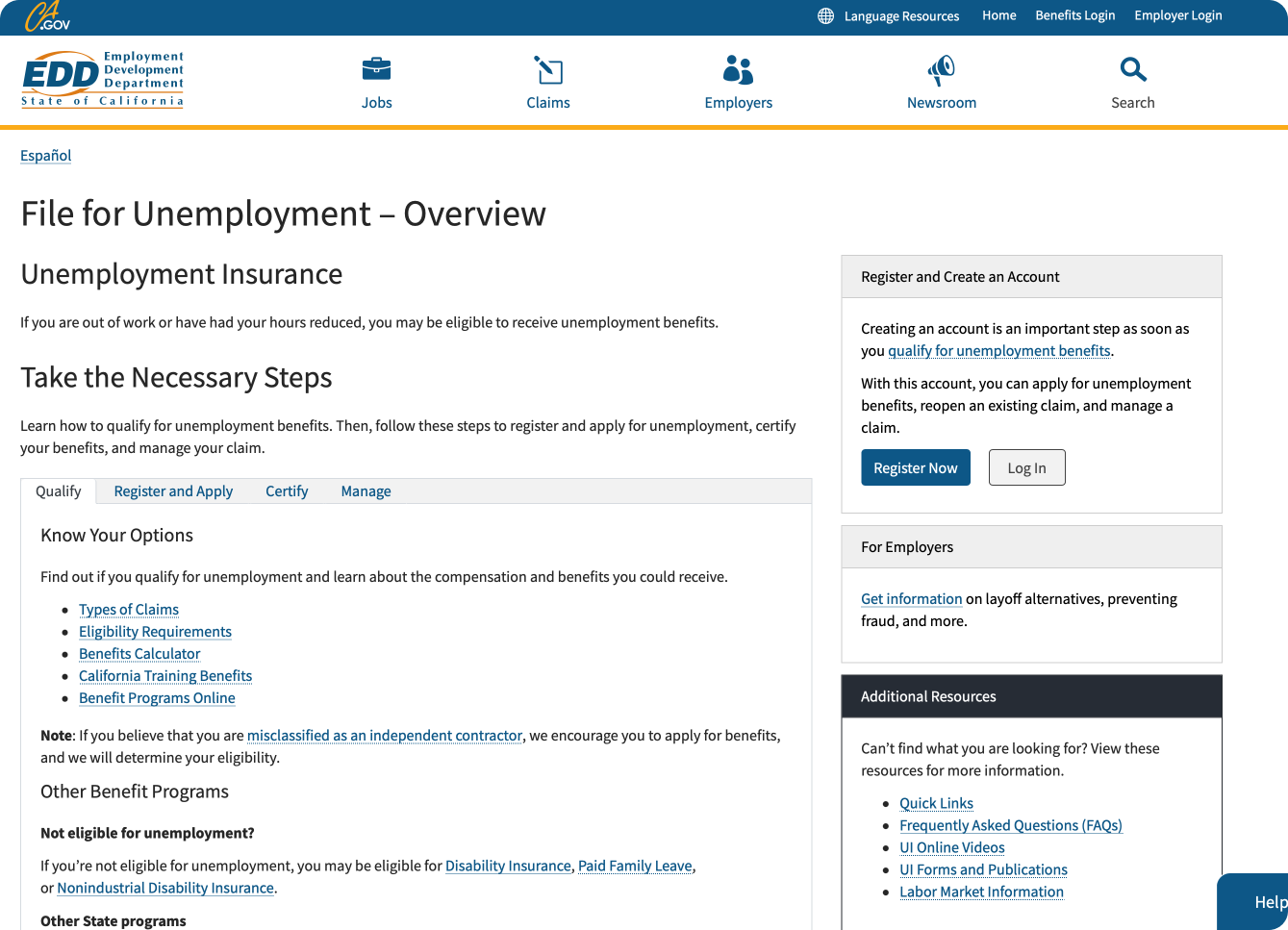
To begin our research, we did an initial usability testing of the existing EDD website to get a visual of how users navigate the site. We asked 2 users to walkthrough the site and "apply” for unemployment benefits.
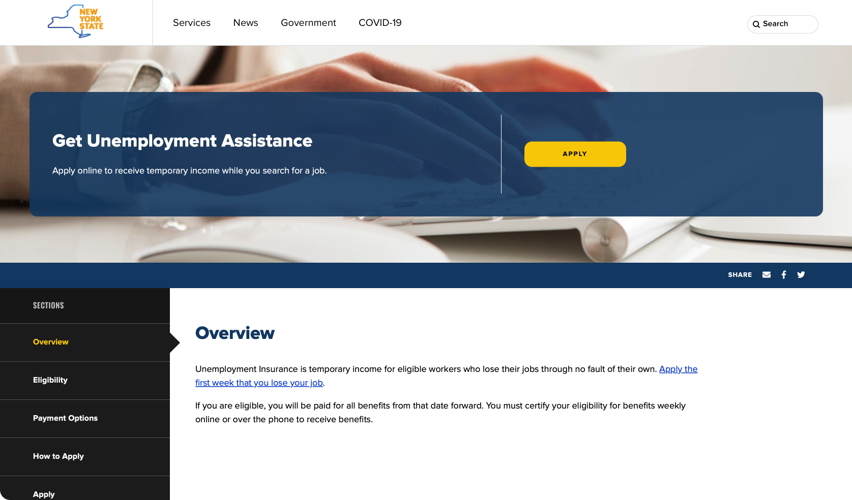
We then did a comparative analysis of current unemployment pages on different state websites, to see different ways benefit information can be organized.
What we learned:
Oregon and New York organized their information into sections
New York’s information page is chronological, and seamless to scroll through.
New York’s page provides an action button to “Apply” at the very top of the page, making it the most easily accessible
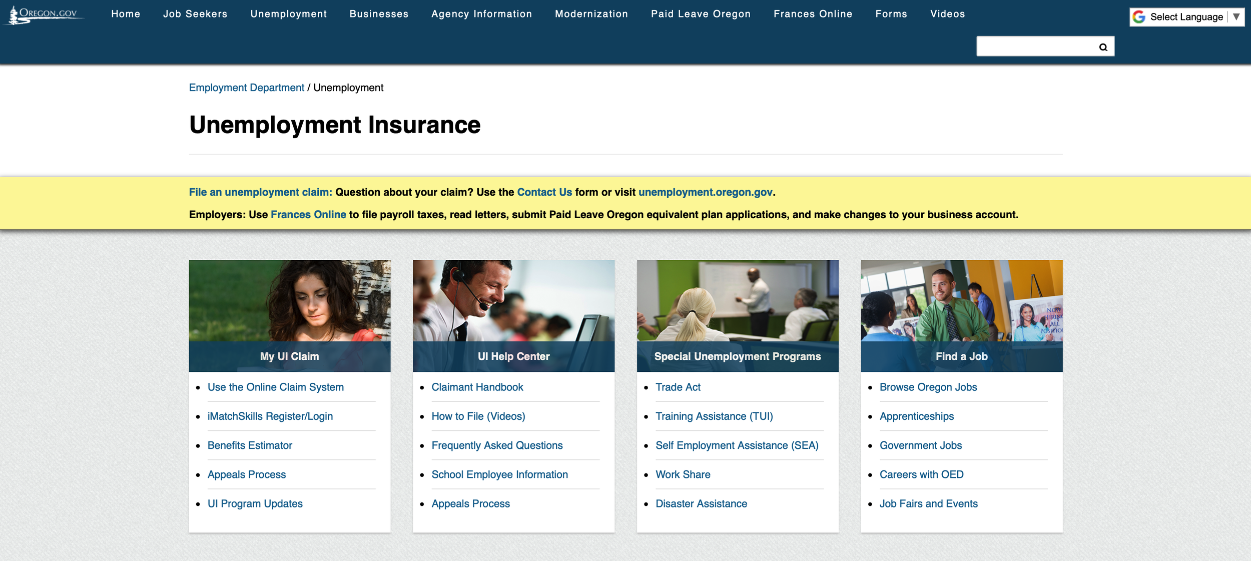
Oregon’s Unemployment Site
New York’s Unemployment Site
Discoveries from User Interviews
We conducted 5 user interviews to gain a more in depth understanding of users’ experiences having used the existing website. We used a series of questions, through conversation, to pinpoint what EDD did well, and to understand user frustrations.
We then used affinity mapping to organize our findings and discuss main takeaways.
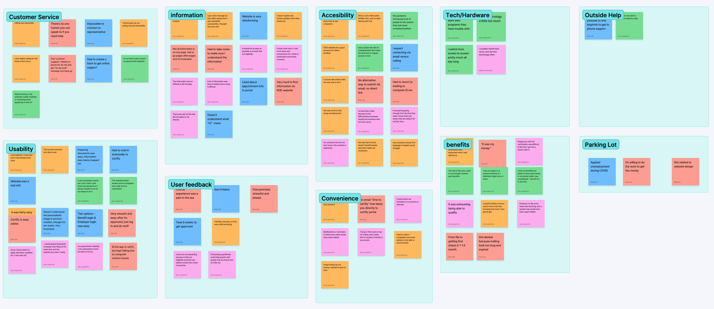
Virtual Affinity mapping using FigJam
What Users Told Us
1. Users felt frustration from the disorganization of information
“Not all information is on one page, I had to go from page to page which was really frustrating.”
“The pandemic introduced a lot of people to the system they never had considered before.”
2. Many new users were experiencing applying for unemployment for the first time
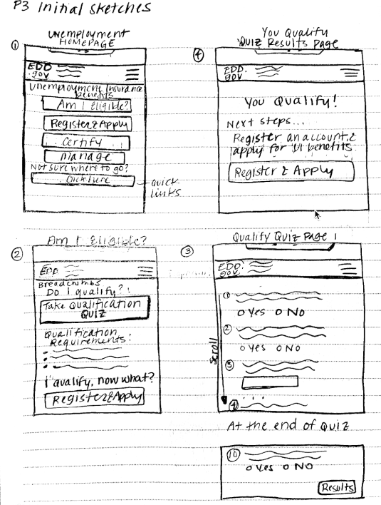
Brainstorming Solutions
Brainstormed the possible user experience for EDD’s unemployment pages
Designing the unemployment application experience required us to brainstorm different flows of how information was organized. We sketched different user flow solutions. We then discussed, consolidated the best features and flows into one solution.
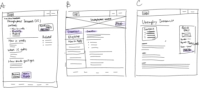
Solution— Creating a space at top of each page with an action button to directly apply
Pain point #1: From the homepage, it was unclear to users where to navigate in order to directly apply.
We decided to make the action of applying easily accessible on every page. The apply now button would be accessible on the top of the homepage, and every sub sequential information page.
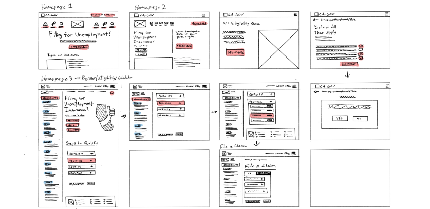
Solution— Added navigation bar on the left side
Pain point #2: Clear Chronological Direction
We added a side bar on the left side of the page that listed the different sections of the information pages. It’s listed in a chronological order of information relevant to the application process and timeline.
Usability Testing Results
We conducted usability testing with our lo-fi prototype. Our goals were to see if our initial solution satisfied the main user pinpoints that we were trying to solve.
Our Findings:
We needed to prioritize clarity
Using iconography would help to break up the text, and help users to understand where they were in the application process
We had some grammar and spelling errors to fix
Users noticed the overall improvement in comparison to the existing site
Final Design